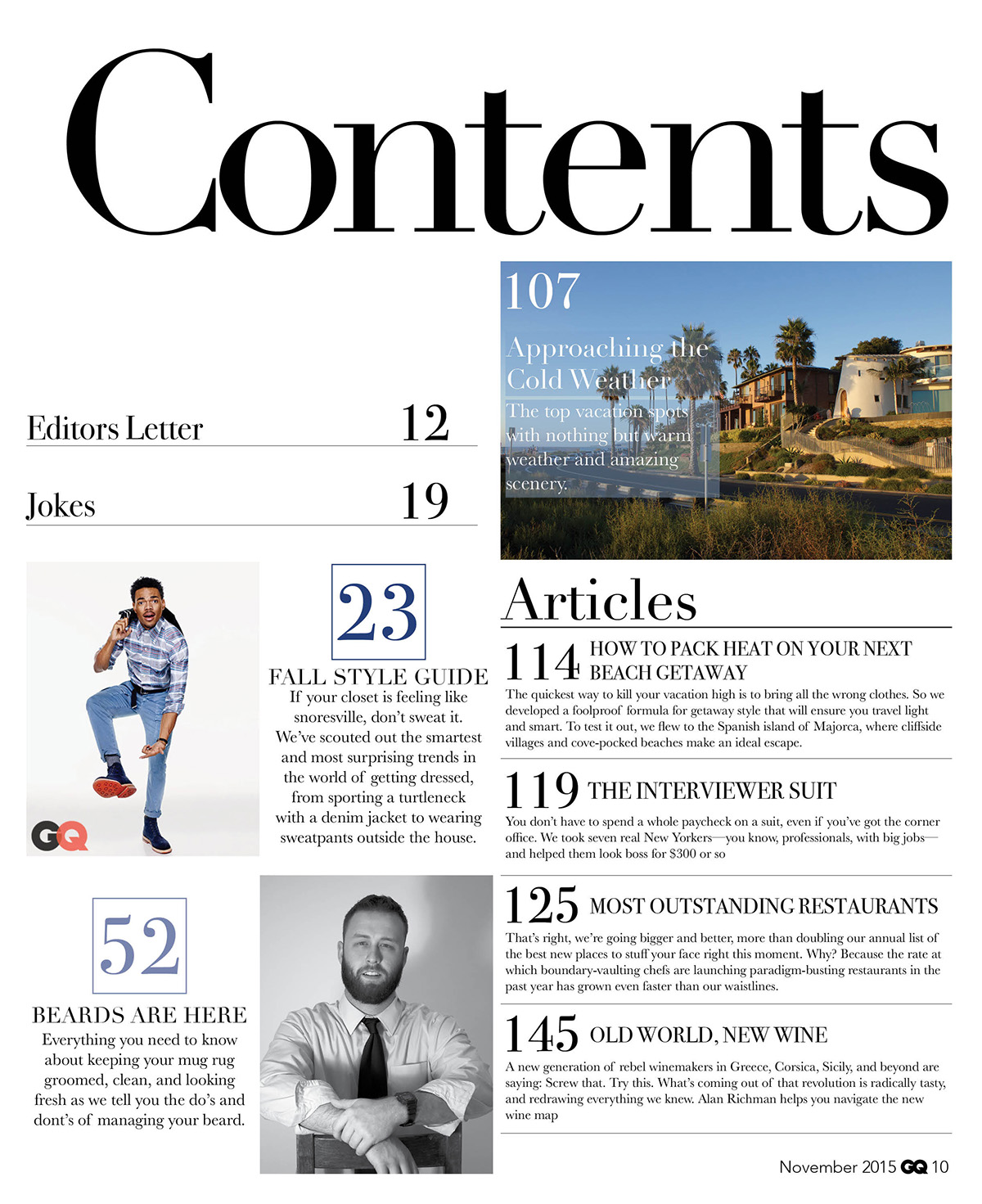
On this contents page of GQ we see a quite a basic layout of black and white, Which gives it quite a comtempory layout. The fonts that are used are of a serif nature which gives the makes the magazine have quite a comtempory and classic layout. We see the main pages which are featured on the contents page with their numbers in a royal blue which makes them stand out on the contents pages. We see a varity of photographs that are used on the contents pages, the first picture that we see is of a typical american new england style house which would typically be located on the west coast. This makes GQ feel that it is meant for the more upmarket readers. We also see the photos of people with a plain white background which makes their costumes stand out to the reader. The photo with the man wearing jeans has body language which gives us the impression that he is showing off. We also see a photo of a main in a suit in black and white, we see from his body language who has his sleeves that are rolled up which shows us thart he is quite relaxed and is in a informal manner.

This is the contents page of Elle magzine, we see the use of sans serif fonts styles throughout the front cover. This makes the contents page feel more modern and gives it of a more up to date feel to the reader. We also see the use of various images on the cover page with some of them more noticeable than others. The most noticable image that we see is of a close up of a lady with lots of eyeshadow on give the impression that makeup and beauty is vital to a womans image. We also notice that she is wearing a lot of makeup which could show us that Elle has been around for a long time because it gives us the typical feel of someone from the 50/60s era when lots of foundation and eyeshow was important. We also see the lady wearing a turquoise blouse which further strenghens the vintage feel to the image. Another image that we see on the contents page is the image with different people in it all wearing quite "out-there" clothes this could show us that Elle is more into fashion that you would typical see at a fashion show, It could also imply that elle isn't just for anyone its for people who want to stand out and feel different from the croud. It could also suggest that Elle would be one of the first ones to get the latest trends in fashion. The other photos that we see in the magazine are chefs in a bar wearing bandanas and are wearing the typical uniform that would be worn in a kitchen. This gives us the impression that Elle is trying to appeal to everyone. We also see close ups of different makeup products gives us the impression of quite high class beauty and makes us feel that fashion is one of the most important identitys of a ladys secret.

This is the contents page for Vogue magazine, We see the use of sans serif fonts in order to give a fresh and modern look to the magazine. We also see the use of caligraphy style fonts which help to date back to Vogues history when is was first published in the 1800s, This types of writing script was used then because of the importance of caligraphy at the time. This gives the magazine a dated look and could show that the magazine has long term traditions. When it is compared to the Elle magazine contents page, this has one main image that is of a female model with quite a controvertial outfit on. We see from the models body language that she looks like she is trying to make a statement. We also see from her facial expressions that she is trying to give a bold impression for them. We see from her outfit it is giving us the impression as a reader from the high heel shoes it could tell us of what is typical of a model, She is wearing quite a dated outfit with silver metallic jacket and a gold metallic bag which could suggest that she is from the 70/80s era. We also see the text "Cover Stories" and "Subscribe To Vogue" in this sans serif font which could suggest that Vogue is new and fresh which gives the reader that feeling that they dont want to miss on any new editions of Vogue.
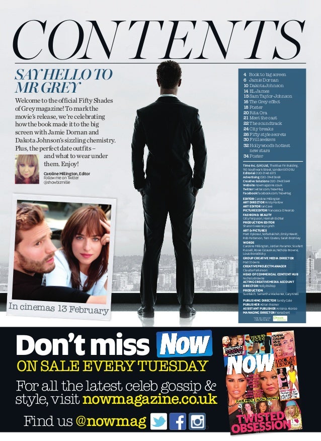
This is the contents page for Look magazine, Firstly we see the word contents in a serif style font to give quite a classic and contempory look for the magazine. The type of text tries to make Look magazine have a more post and upmarket feel to it. This tries to get people to feel that look magazine is more posh than it actually is. We also see how the text is positioned on one large photo as the contents page. The photo that we see on the contents page is a photo with a james bond style character facing the window to give us the reader the feel that he is a spy character. The model in the picture is also wearing a suit in order to us a formal feel when looking at the magazine cover. We also see another image on the contents page, this is of a scene from the movie fifty shades of grey in order to get people to purchase the magazine. The image that they have chosen is a scene that most people would be intreagued to find out what happens because it is of a scene when they are here. We see the use of text "Say Hello To Mr Grey" which could suggest to us that the main part of the magazine is to do with the book Fifty Shade of Grey. We see the also the use of sans serif fonts where the contents of the magazine are listed.

This is the contents page for Grazia Magazine, Firstly we see a photo of a lady model with a dress on, We see her with a dress that stands out and makes a statement for us because the dark colour of the dress stands out in contrast to the beige background of the magazine. This give the effect to the person that is reading the magazine give quite a vintage feel to the magazine. We also see from her facial expressions that she looks like she has a attitude that she dosent care, this give the reader the impression that it is a carefree lifestyle with fashion and you are able to do it how you want. We also see the word "Contents" in a serif font to give it a vintage feel and look towards the readers. We also see a large use of yellow on the contents page in order to give a vintage feel and look towards the reader. The text we have seen on the contents page is in a serif style font in order to give that classic feel to them.
This task has helped me with making my magazine because it has allowed me to get some inspiration with my magazine and be able to give me useful ideas with my cover pages myself. The main advantages of this is the different varity of ideas that are avaliable for them to use. The other way in this task has helped me is that it has given me a range of different ideas in order for them to use it. This makes it more easier for me to choose what type of magazine i would like to create.
No comments:
Post a Comment